Watercolour Flowers in Yuliana's memory #niunamenos
August 12, 2017
I'm sharing 3 related blog posts today . All the projects in these posts were created using the same stamping tools and I also want to share a bit of the struggle behind the creative process.
In this first post you will find pictures of a first project I made while I was trying old watercolour techniques with Brusho Crystal Colour Pigments and Simon Says Stamps Supplies.
It was late at night - about 11:30pm and that day I was feeling particularly emotional because I heard something in the news that really made me think. I was a bit sad and angry and that completely affected my work.
As you can see this composition is not bright or happy . I found it chaotic and perhaps a bit ugly.
This scene was made thinking of Yuliana Samboni. She was a little girl who died last year in terrible circumstances in my country and I have been making little compositions to honour her memory. It seems to be a bit crazy as I didn't know Yuliana or her family but her death have really touched me.
If you want to see other projects inspired by Yuliana click here, here, here, here, here, here, and here! a new window will open and you won't lose this tread .
So Yuliana and her parents have been present in my prayers for many moons and this piece is an expression of that.
How I did it?
- I stamped Yuliana's name using Versamak Black ink and I applied masking fluid on the letters as I knew I was going to stamp and applied colours over it.
- I stamped some flowers and leaves randomly around the fonts using Distress Antique linen ink. I wasn't really thinking but when I finished I noticed the images give the impression of being a flower or a crown of thorns.
- I used water brushes to apply pigment powders mixed with water. The powders produce a translucent watercolour so I applied several layers of colour.
- I used red, yellow, orange and brown powders to colour the roses. Green and yellow added colour to the leaves and a wrong combination of black, purple and ultramarine for the background.
- As I had the idea to create the flowers as if they are crying real tears I used a straw to blow the ink in different directions to try to give shape to the tears. I think this effect would look better if the images were stamped in a different orientation.
- When I finished I removed the masking fluid and I applied a gold marker on the founts but I think I also chose the wrong colour to do this. I applied Nuvo glaze on the letters which is fantastic to add dimension... it is very similar to glossy accents but it is a bit more soft and creamy. It takes longer to dry as well so I messed up with it too.
- Then I used a craft knife to cut out the center of the piece, around the letters. This took me ages and when I finished I thought I wasn't doing any favours to the composition.
The next day I sat to craft again .. I tried to develop the same idea click on next to see how the concept was taking another shape...
That's all!
I really hope you can get something positive from this post. Please do not hesitate to ask any questions or leave a comment I would love to hear from you.
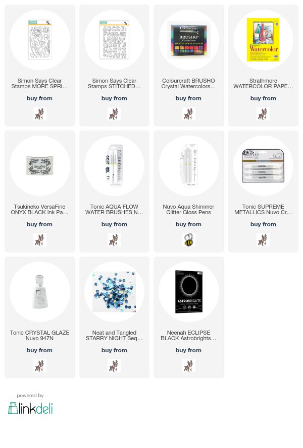
If you would like to place an order for any of the products used or any other craft supply simply click on any of the images below to go direct to online shops 24/7. Affiliate links apply so I get a small commission when you buy through these links at no extra cost to you.
Thanks for your support.
x
Bibi


0 comments
Thanks for your comments.